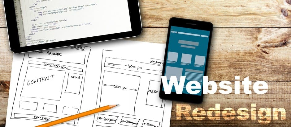
If you’re redesigning your website, make sure to carefully consider upgrades and changes. Here are 10 things to put on your checklist as you begin:
1. Is your website design mobile-friendly? Statistics show that more than 63 percent of mobile phone users access online content through their devices. Many people, especially younger people and those in urban areas, are more likely to access your website via a cell phone, tablet or other mobile device. If your website can’t quickly recognize mobile users and scale appropriately, you will lose a lot of traffic.
2. Is navigation straightforward? Are the high-traffic areas easily accessible? Don’t leave anything to question. Make sure every user can easily get to important sections of your site without having to search for buttons or tabs.
3. Is there an “About Us” page accessible from the home page of the site? Having an easy-to-locate “About Us” link provides your customers/audience with quick access to information about your intentions and what you have to offer them.
4. Is your security up-to-date? Making sure your site is secure is vital. Even small business who don’t think they will get hacked are canidates for any hacker. Security is especially important if you require a customer login or process payments.
5. Is your payment processing secure, easy to use and affordable? There are many new options for payment processing. Take the time to explore newer options; they may cost you less per payment for processing.
6. Did you pick the right color scheme? Contrast helps with visibility, but too many bright colors may make reading difficult or distract the eye. The colors and design of your site should never be so distracting that the content is difficult to find and/or read.
7. Is your tone and visual style consistent throughout the website? Visitors will expect aesthetically similar content. Not only may they be turned off by an unexpected change, they can become confused about the flow of your site. Users that become too challenged or confused will abandon your site.
8. Do you provide multiple ways for visitors to contact you? Not every user interacts in the same way. Offering email and social media platforms as points of contact is important.
9. Have you integrated social media widget buttons on sidebars/individual pages? Visitors may want to follow you on their social media platform of choice. Make it easy for them and you increase your traffic!
10. Have you taken steps to maximize accessibility? This is important for all users, but is especially worth noting if your intended audience/customer base includes senior citizens. You want to consider how accessible and easy-to-view your website is for those without perfect eyesight.


Leave A Comment