Prevent Common Errors to Create Welcoming Websites
Your website is the face of your company. Within approximately 50 milliseconds, visitors form an opinion about your website and what they believe about your business. It’s vital that you get it right. When you decide to make changes, there are website redesign mistakes you should avoid. Sidestep some of the biggest errors with this guidance.
- Not analyzing your current website
If you decide to change just for the sake of change, that is highly problematic. You can’t make assumptions about what’s not working; you must find the problem. The way to do this is through an analysis of your current website. Take the time to do it thoroughly; some things you think aren’t working well may be the very thing that are drawing visitors in. You just never know. Find the problems and get to fixing them through a redesign.
- Not setting goals
When you don’t know what you want to achieve from a website redesign, then you won’t know whether you’ve made progress or not. Set a clear goal so you can measure success. During this process, you should become aware of the parts of the redesign that will require more attention than others.
- Not focusing enough on usability
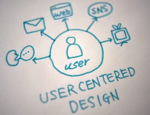
People often redesign for a “look” instead of a “feel.” You can create a super slick site, but if it’s not user-friendly and visitors struggle to navigate it, you will lose them. Remember one objective: a website should inform your customers about who you are and what products and/or services you offer. Ensure a good experience for all users by adhering to accessibility best practices and ADA guidelines.
- Unclear calls-to-action (CTA)
To convert visitors to customers, you must guide them to where they should go. An effective CTA should lead visitors to the desired action, such as signing up for a newsletter, registering for an event, scheduling an appointment, or downloading a whitepaper. Don’t confuse users with multiple link options when you want them to follow a CTA.
- Not calculating the redesign budget
Analyzing the website, creating a strategy, and working toward a successful redesign take time to accomplish. Understanding each step in the process and the budget is essential to move forward and reaching goals. Take time to plan the redesign so an appropriate budget can be set.
- Not providing enough time for the designers
While it is important to set deadlines, the deadlines must be realistic. A website redesign can be complex and sometimes challenging. While templates may save time compared to custom redesigns, designers need ample time to do their jobs properly.
- Not making your website mobile-friendly
More than 92% of internet users access the internet using a mobile phone. It has become essential for businesses to keep mobile users in mind while going through a website redesign. Be sure to deliver the same experience you’d provide a desktop user.
- Failing to transfer content to the new site
If you want to preserve the SEO value of your old site, you can’t forget about the blogs, articles, whitepapers, or other content that pulled users in. Migrating all that content can be a difficult task, but it’s vital for adding value to your site and will impact your organic web traffic if it is forgotten.
Here to help
The T.E. Digital team has the knowledge and expertise to assist with even the most challenging redesign issues. We can help you avoid website redesign mistakes.
Reach out to T.E. Digital for a consultation, and we can get you started on the right path.


Leave A Comment